Welcome to my "Honorable Credits" page!
This is where i'm giving due credit to all of the resources i've used (and been inspired from) for my own website!
Without these, my site won't have been the way it is nowadays

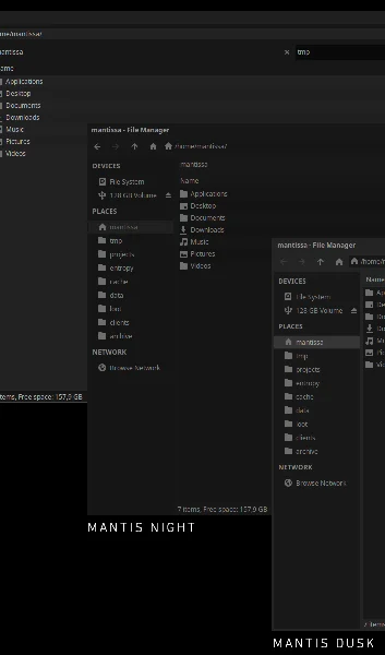
One of my favorite themes for GTK and XFCE4, alongside Arc-Dark, that was the inspiration behind the themed divs. I used to have this theme both on my (former) Linux Mint & current Debian setup.
Reason why i've liked it lots was, especially, how it reduced the RAM usage in my XFCE setup (used to be around 450mbs~)- but since with time my tastes and setup changed later on, i had ditched XFCE in favor of PekWM (as of 2024), and after some while into JWM (as of 2025 onwards).
Despite i had abandoned PekWM due to it's own package having issues on Debian, i had done in 2023 a port of one of it's variations, Mantis Night, for PekWM (only works under v0.2.0 onwards) and a full port for JWM in 2025.
If you want to give a good look to the original theme (even though no new commit has been pushed in ages), you can give a look to it's GitHub repo. This theme's criminally underrated.
This is the color palette i've used for the entirety of my website, excluding some images (on some i had used ImageGoNord). The following originated as a VIM palette, which then got adopted into various themes and such for the Linux desktop. I had decided to adopt it for my website's to give it a consistent look.
This is the font i've picked for my website, it's basically the same font i use in my terminal emulator and i like it really much.
I might come across as "generic" for liking it, but i don't mind that.

It may sound curious, but on my webpage there is a bunch of artwork i had exclusively (and not) made for my webpage. You can either find it by exploring each and every page, or by looking through it's source code on Codeberg lol.

As far as i can remember, i had found this very website in 2022, in the midst of a Reddit browse.
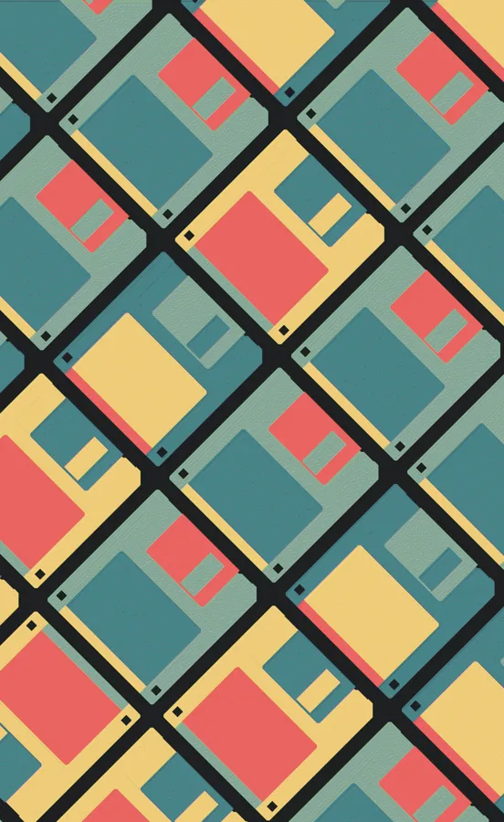
Once i had looked through the images it offered, i had decided to put them on my website (albeit modified to reduce webpage loading times) due to both complementing it's "desktop-look" and was a great fit for a background choice-
which i had started adopting it ever since it's original inception on GitHub Pages, but then moved on Codeberg Pages due to privacy concerns.
If you may have noticed, (almost) all of my webpages contain a small credit on the bottom-left, this should point which author did said background. Overall, biggest props to this website's existence and contributors.
This was the website i had used for outsourcing almost all of the icons for my website (navbar and some of the landing page's social media icons).
While they are amazing as a source to get all of your icons from, i'd healthily suggest to use what it offers locally-saved on your webpage, since their servers are molasses slow at serving anything outside of their website.
If you want to use any of the icons that they produce and offer, you can go ahead- but at one condition:
you must put proper credit to their website on your website, somewhere (just like what i am doing here).

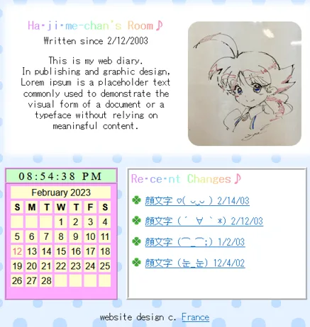
This is, without doubt, the best part of the internet my eyes has ever saw.
If it wasn't for this part of the indie web, i won't have ever got the final push to ever create my own website as unique (or as "me vibes") as possible- otherwise it might have been something similar as bestmotherfucking.website, since this was my initial inspiration for my webpage (far, far before conceptualizing it's looks).
Biggest props to the community behind it, because otherwise i won't have had such a change of heart in the first place.